Yes, Databox is very good at unifying your scattered data into automated KPI dashboards. Its core power is connecting to over 100+ data sources like Google Analytics, Mixpanel, HubSpot, and ad platforms, letting you see the whole picture in one place. You can set it up in hours and eliminate manual reporting forever, giving teams time back and leaders the clarity they need.
Business value rating: 8.5/10
Ideal for: Business leaders, marketing teams, and agencies who need a single, automated view of performance across multiple platforms without technical overhead.
What core problem does Databox solve for teams?
In most offices, the marketing team lives in GA4 and HubSpot, the sales team is buried in Salesforce, and the finance team has its own system. By Friday afternoon, someone is stuck with the soul-crushing task of copying and pasting numbers from five different platforms into a spreadsheet to build the Monday morning report.
The result is always the same: executives make decisions based on week-old data, and teams are disconnected, chasing different targets because they aren't looking at the same numbers.
Databox eliminates this entire broken cycle. Instead of manual data gathering, you get unified KPI dashboards that automatically pull from all your tools. Instead of stale PowerPoints, stakeholders receive automated, AI-powered performance summaries like, "Your lead generation increased 23% this week, but your lead-to-sale conversion rate dropped 8%, driven by a lower-quality campaign." This is the difference between seeing numbers and getting answers.
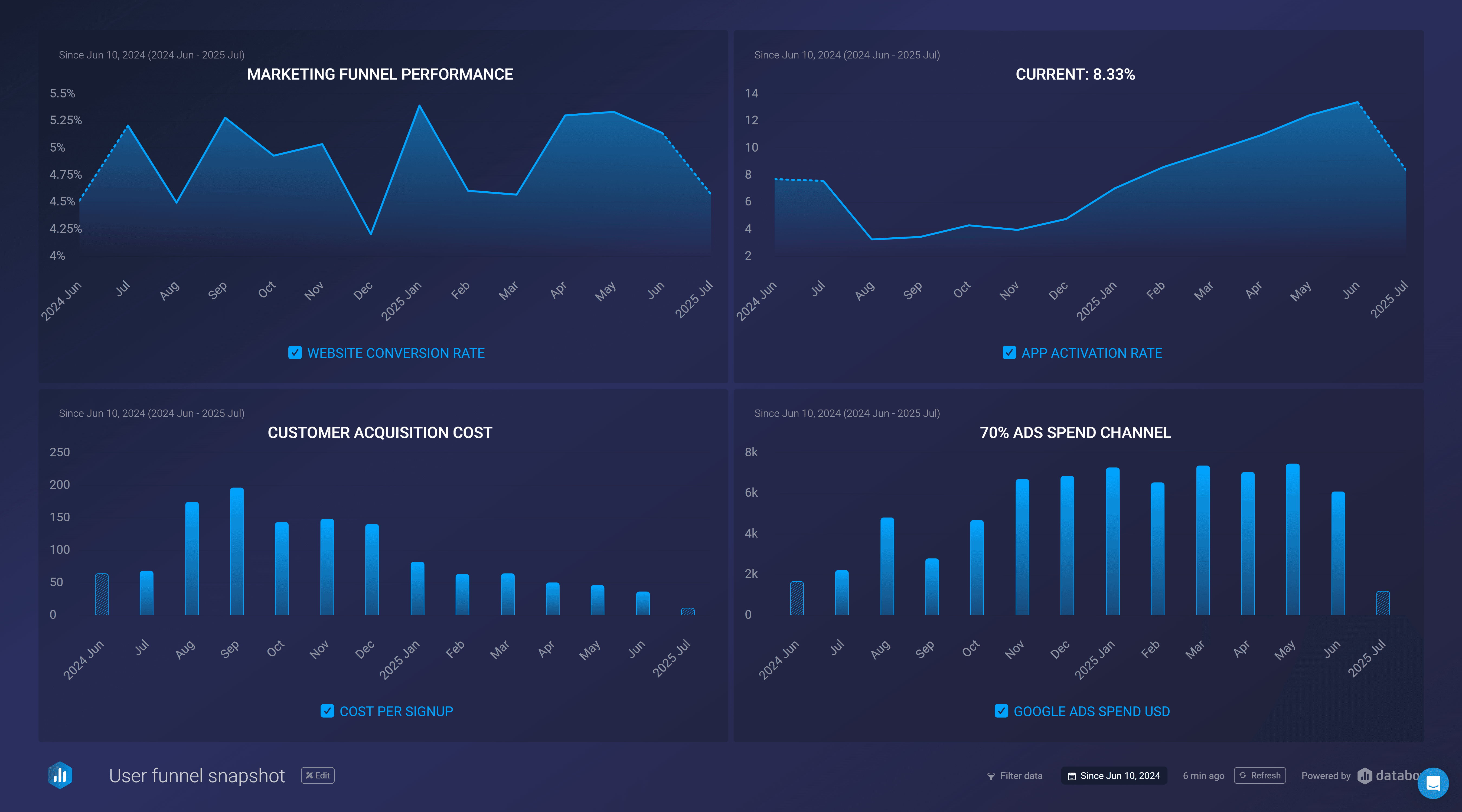
Below you see a KPI dashboard built with Databox connecting metrics from GA4, Google Ads and Amplitude, which updates live once setup.
What makes Databox more than just another KPI dashboard tool?
After spending a week testing Databox's unified dashboard capabilities, what impressed us most was how the platform transforms disconnected data into a cohesive management system. Here's how Databox's unified approach actually works in practice:
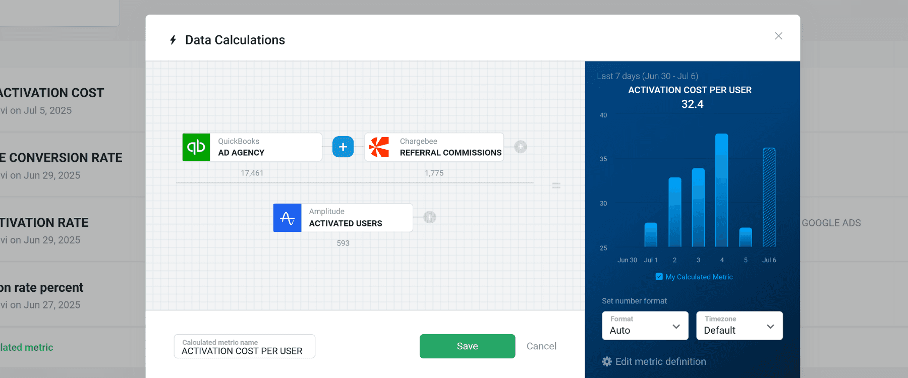
Creating calculated metrics from multiple data sources
Most dashboard tools just display what your individual platforms already track. But your most important business metrics don't live in any single tool. True Return on Ad Spend, for example, may require require pulling costs from five different ad platforms and revenue data from your payment processor.
Databox's unified dashboard approach shines here. We were able to create a custom calculated metric, activation cost per user, that automatically pulls Chargebee referral payments, QuickBooks marketing expenses, and activated users from Amplitude. The result is a single, live metric that shows real activation cost. Instead of looking at siloed data, you can see business health in one place with such custom metrics.
Turning custom metrics into aligned team goals
A custom metric is just a number until your team can rally around it. What makes Databox's dashboard unification valuable is how it connects your cross-platform KPIs to specific team targets.
For instance, a marketing director can set the team's quarterly goal directly against that custom "Revenue per Marketing Dollar" metric. This transforms the number into a live visualization on the unified dashboard for everyone to see. Marketing, sales, and leadership are now looking at the same numbers and working toward the same target, creating genuine team alignment.
Delivering automated reports to keep stakeholders informed
The real test of any unified dashboard is whether busy stakeholders actually use it. Leaders won't log into another platform, and they shouldn't have to.
Databox's automated reporting feature takes your unified KPI dashboard and sends clean AI performance summaries directly to inboxes. You set it up once and your stakeholders get the vital insights they need without you lifting a finger. It's a massive time-saver and makes you look incredibly organized.
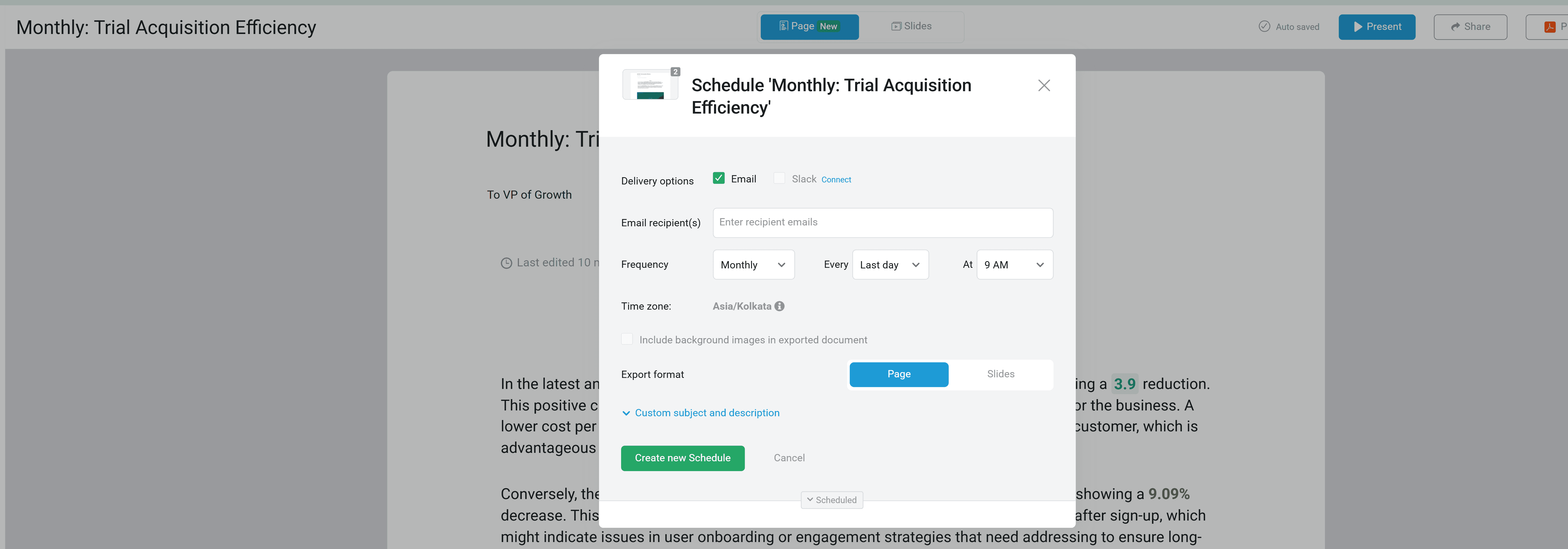
A preview of what your leadership will receive in their inbox:
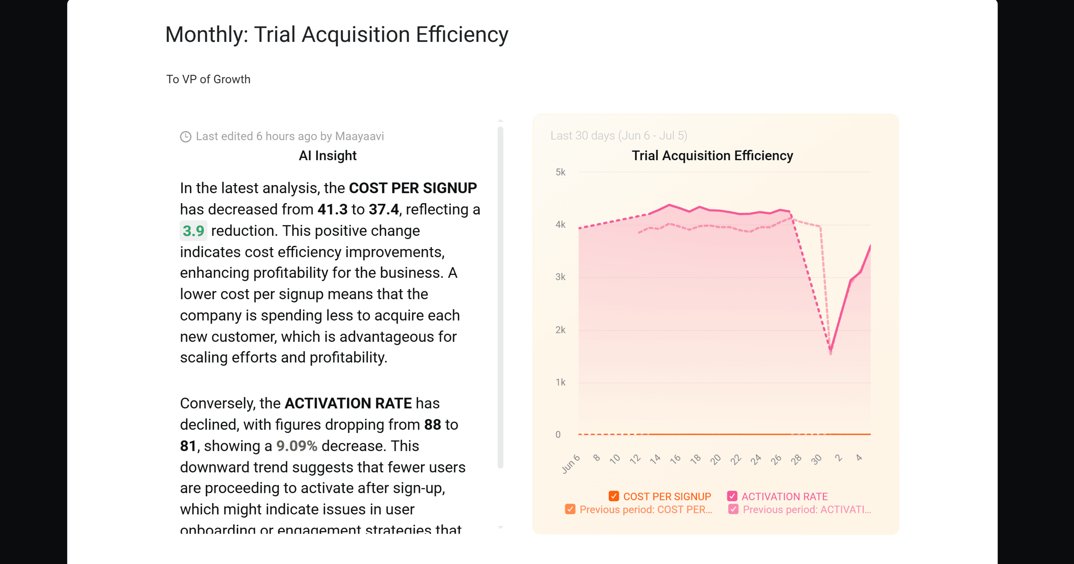
The AI summaries are surprisingly good too, providing context like "Organic traffic is up 15% WoW, primarily driven by new blog content, but conversion rates dropped 3% due to mobile page speed issues."
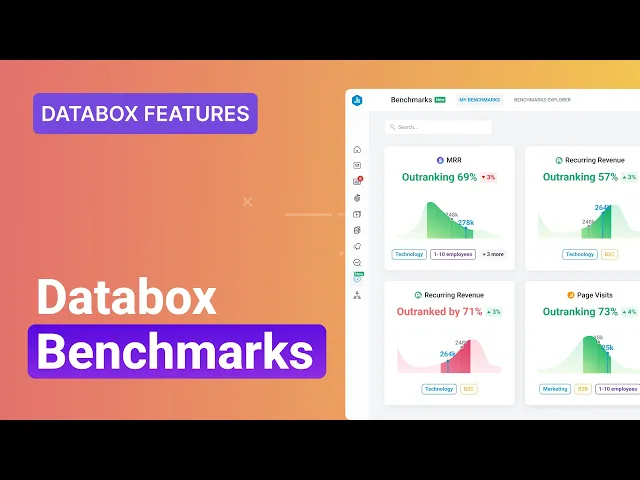
Benchmarking your performance against industry peers
Here's something most dashboard tools miss: a 2% conversion rate means nothing without context. Databox's Benchmarks feature helps you compare your KPIs against anonymized data from thousands of other companies, filtered by industry and size.
Seeing that your customer acquisition cost is 40% higher than similar B2B companies can be a wake-up call that no internal dashboard provides. This industry context transforms your KPI dashboard from a monitoring tool into a strategic asset.
It's worth noting that this feature requires at least six months of consistent data to provide meaningful comparisons. Since our site is fairly new, we couldn't properly evaluate Benchmarks with our personal data. To see it in action, we've attached a video from Databox that explains the feature well.
AI forecasting and AI performance summaries
Instead of guessing whether you'll hit quarterly targets, Databox's AI forecasting, using Meta's Prophet model, analyzes your unified data to provide data-driven projections for the next quarter to the next year. This works across your entire connected ecosystem.
The AI performance summaries also eliminate the "blank stare" at a complex dashboard. It provides an immediate starting point with plain-text takeaways, like, "Organic traffic is up 15% WoW, primarily driven by our new blog content," making the data instantly accessible to everyone on the team.

How fast can you set up unified KPI dashboards with Databox?
The claim of getting a dashboard running in minutes is true for basic single-source setups. For a truly unified, multi-source dashboard that leverages all the capabilities above, plan on a few hours to get it dialed in properly. But here's the key: you do this work once, then the unified dashboard runs automatically forever.
When shouldn't you use Databox?
The trade-off for Databox's speed and simplicity is its limited analytical depth. It is not a tool for deep-dive, exploratory analysis.
You will hit a wall if your task requires complex data modeling or sifting through massive, raw datasets to answer a vague "why" question. That kind of deep investigation is the specific job of business intelligence (BI) platforms like Tableau or Power BI. Databox is built to monitor the KPIs you have already identified as important.
How does Databox pricing compare to alternatives?
Databox (Free-forever plan; paid plans start at $159/month)
Databox offers a functional free-forever plan, but its core value for hands-off, automated reporting lies in its higher tiers. To get the AI-generated text summaries that are critical for informing stakeholders without manual work, you need the Growth plan. For a serious setup with roughly 25 data sources, the total cost can climb towards $500/month, factoring in the per-source fee.
This investment makes sense when your primary goal is to fully automate reporting and eliminate weekly manual updates. It's worth noting that unlike some competitors, Databox’s add-ons are for specific agency needs like white-labeling, not essential platform features.
Klipfolio (Paid plans start at $120/month + expensive add-ons)
Klipfolio's platform is designed for technical users who demand deep, granular control over their dashboards. Its pricing model, however, is a minefield of expensive add-ons that punish you for needing basic functionality. Core business features like Single Sign-On (SSO) are locked behind a separate monthly fee, making its initial price misleading. This platform is a compelling, developer-centric tool for teams with the budget and technical skill for complex data modeling, but its a la carte pricing makes it a poor value proposition for most businesses.
Geckoboard (Paid plans start at $60/month; priced per dashboard)
Geckoboard has a straightforward pricing structure and excels at creating simple, clean dashboards meant for high-level visibility on shared office screens. It's an excellent choice if your sole purpose is to display a handful of key performance indicators for your team. However, the platform is for displaying data, not for deep analysis or automated reporting.
FAQs on Databox
Can Databox send reports to people who aren't users?
Yes. You can schedule automated reports and AI summaries to be emailed to any stakeholder, inside or outside your company. This is ideal for executive briefings or client reporting.
How does Databox handle data from custom, in-house systems?
For systems without native integration, you can pull data in using Google Sheets, Excel, or by connecting directly to a SQL database. This requires more setup but allows you to integrate proprietary data into your unified dashboards.
Are the AI insights actually useful?
Yes, for high-level summaries. The AI performance insights provide simple, text-based summaries of performance changes. It's effective for quick takeaways on scheduled reports but won't replace human analysis for deep-seated issues.
When should you choose Power BI instead of Databox?
Choose a dedicated BI platform like Power BI or Tableau when your primary goal is deep, exploratory data analysis across the entire organization. These tools are analytical engines designed to connect to raw data and answer complex, ad-hoc "why" questions that Databox's unified dashboard approach isn't built for.
Final verdict on Databox
Databox delivers on a critical business need: a single, automated view of all your key metrics. It excels at breaking down data silos and saves 6+ hours per week per team doing manual reporting. It is also fairly simple to set up with no complex nuances.
Our recommendation
If your goal is to save hours of manual reporting each week, align your teams around common targets, and give stakeholders automatic, clear updates, Databox is the right investment.